Pulcinella Youth Hostel
Antwerp, Belgium
2010
Historically the site was part of an enclosed urban block. Following periods of dilapidation, the site was vacant for decades and existed as a blank canvas in the historic heart of Antwerp, embraced within a neighbourhood as a place to meet and socialize.
An urban square is an element that perfectly characterizes its surroundings and determines its aesthetic quality and expression. Remarkably, most squares in Antwerp are flanked by buildings of a (semi-)public nature, such as churches, museums and hospitals. Therefore it was logical for the city of Antwerp to develop the site as a new take on this principle, dedicating a large part of it to a new youth hostel. The building was situated so that it would enclose the block while recreating the urban square. The urban block is once again complete and the homogeneous urban fabric has been mended. The built environment in this area of Antwerp consists of historic buildings, townhouses and other medium-sized buildings. The latter originally housed light industry, but today often contain converted apartments or housing for senior citizens. However, none of the existing structures gave the environment a specific quality or added any particular value.
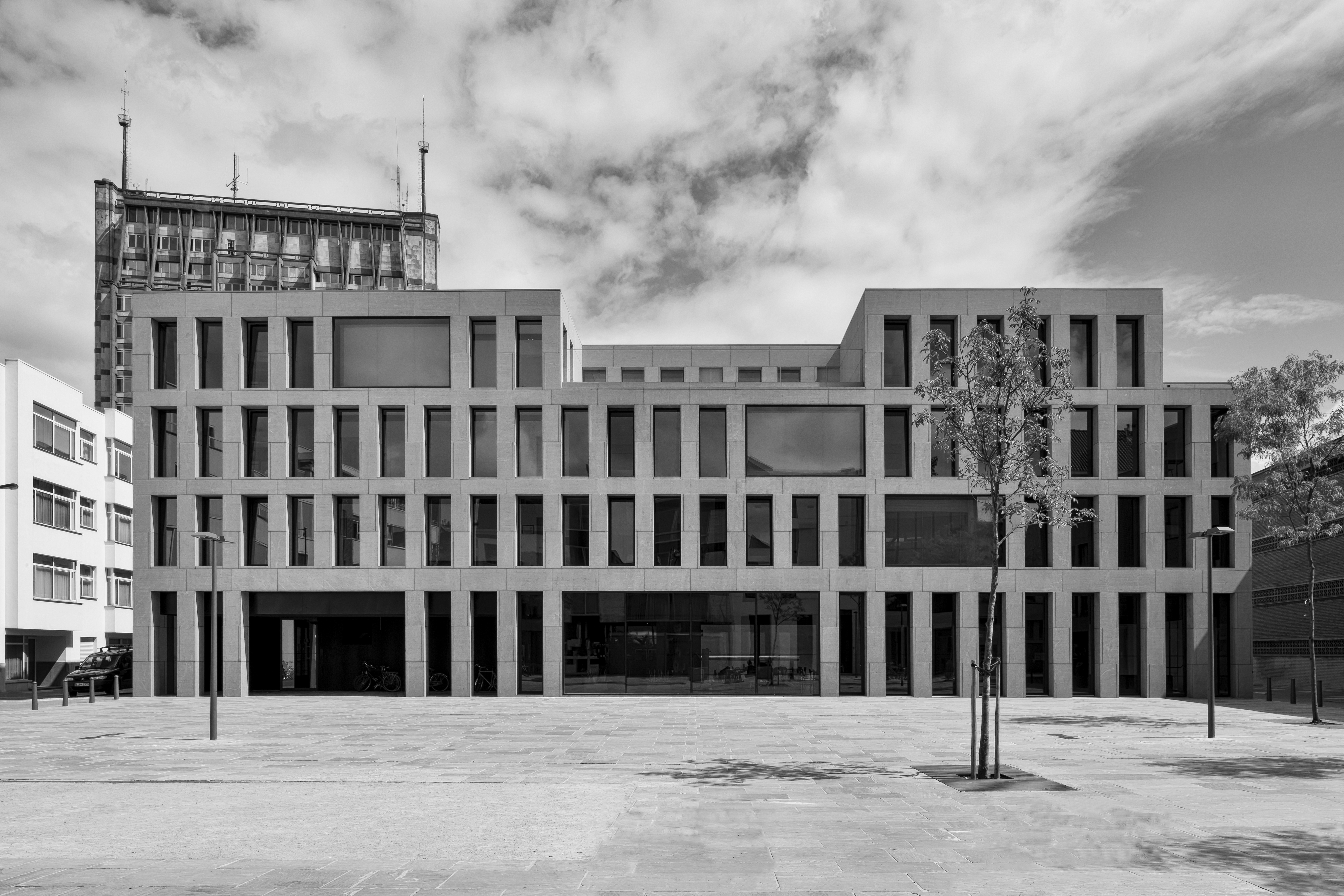
The monotonous quality of the grey urban fabric is determined by its homogeneous character, which on the scale of the neighbourhood in the city can be considered as a positive. By using a single volume adjusted to its surroundings, choosing a classical window typology and rhythm, and selecting a grey palette of materials a building is created that seamlessly fits into its surroundings. A slight difference in scale, the natural stone façade and its unmistakably contemporary expression are subtle elements that set the building apart. The urban square is given a new face, and the architectural language defines the semi-public character of the new youth hostel.
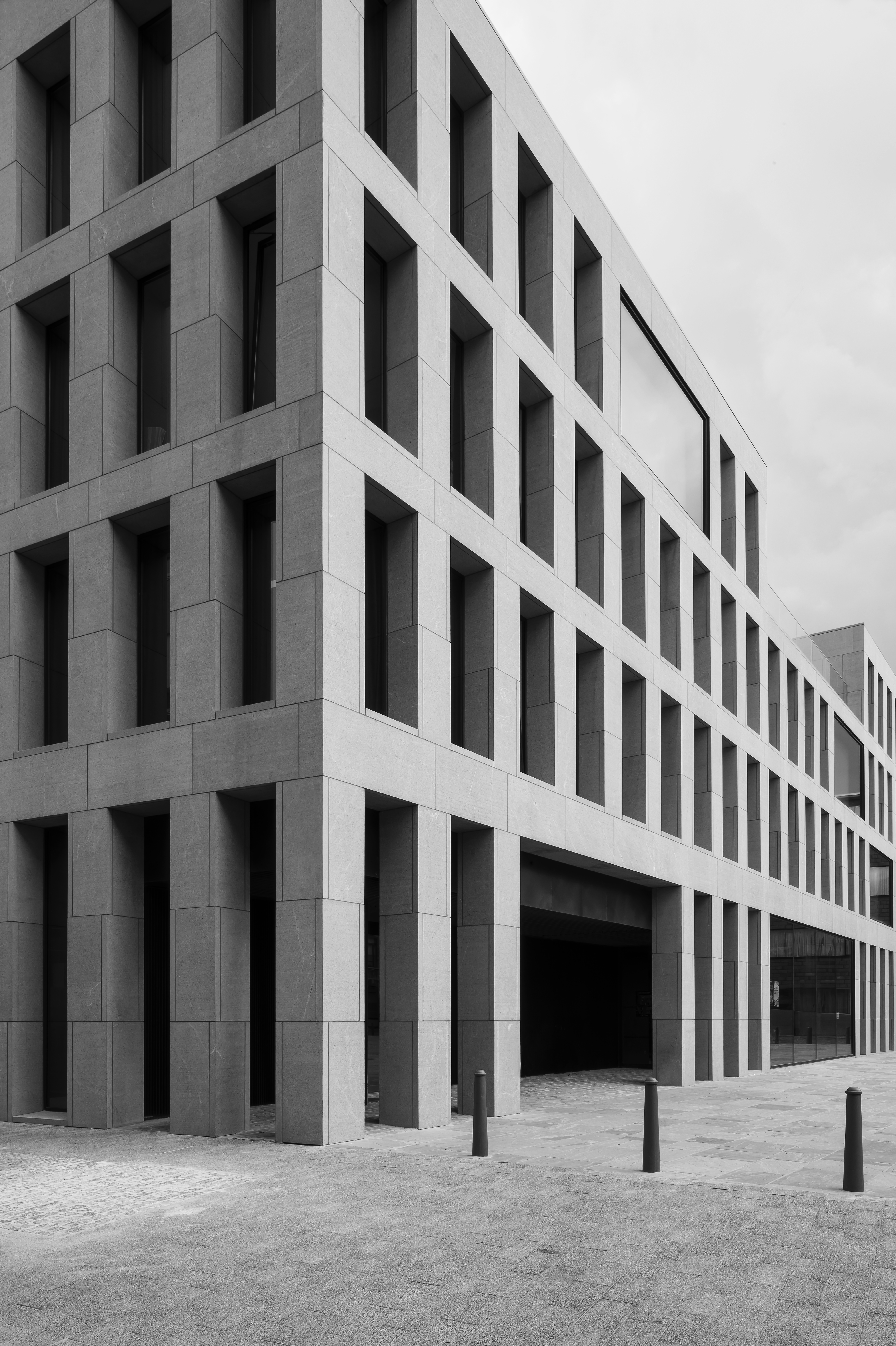
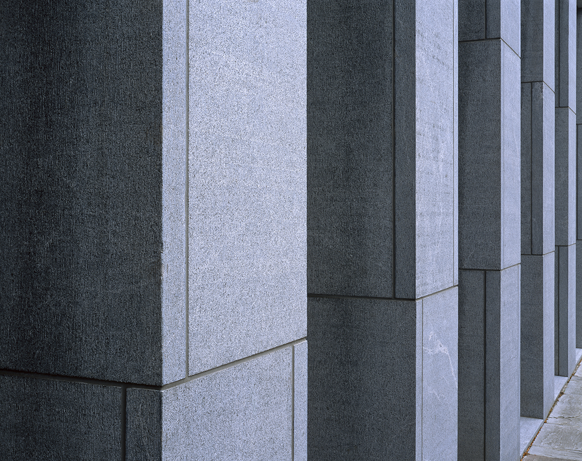
The expression of the building is on the one hand determined by the characteristic façade, but also through the volume and the consistent use of a limited palette of materials. The contemporary façade is built up from natural grey stone, fitting in with the surrounding grey environment. This use of material refers to a tradition of using Belgian bluestone for column treatments, lintels, thresholds and other ornaments.
The rhythm of the façade is consistent with the vertical proportions often seen on traditional buildings in inner-city Antwerp. This rhythm is interrupted only by large windows, where the building enters a direct dialogue with the environment. On the ground level these openings offer entrances to the building while also establishing connections between the square and the café. On the upper floors lounges are situated in front of these large windows, and after sundown video installations by the artist Michel François are projected on to the large openings. The large glass panes are flush with the façade cladding, which underlines the contemporary character of the building. Windows to the bedrooms are recessed deep into the façade, adding to the solid expression of the architecture, while reducing the amount of direct sunlight and heat that enters the building and also providing privacy for guests. A light and open atmosphere is created in the interior spaces.
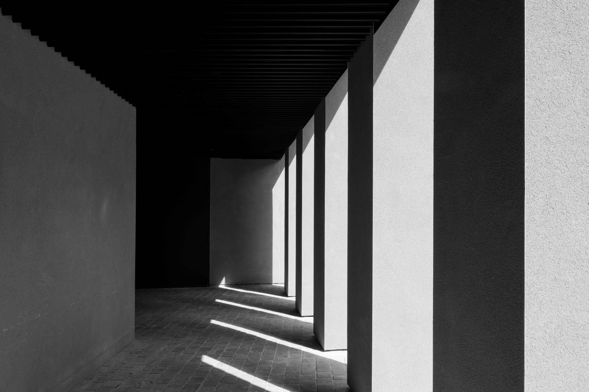
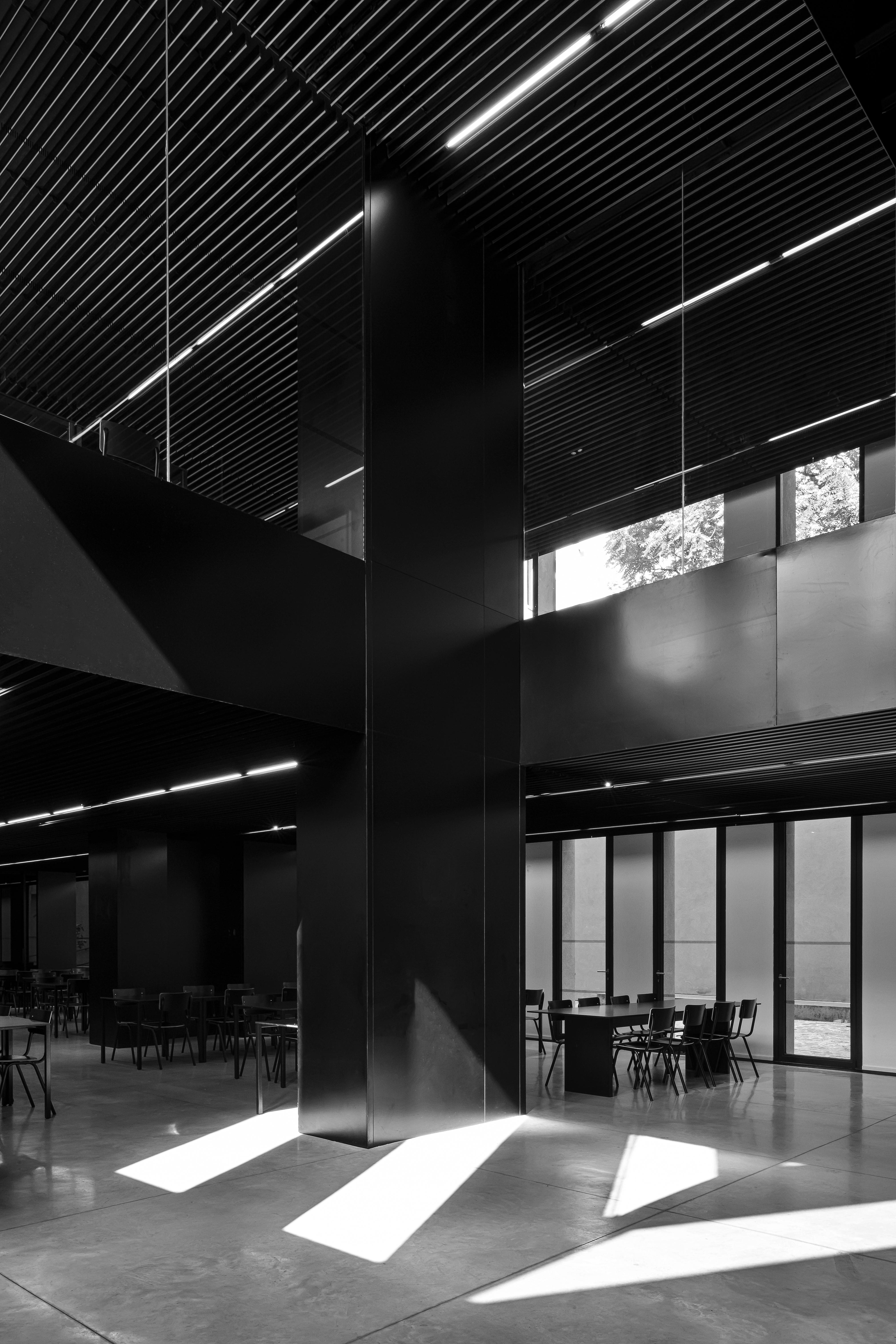
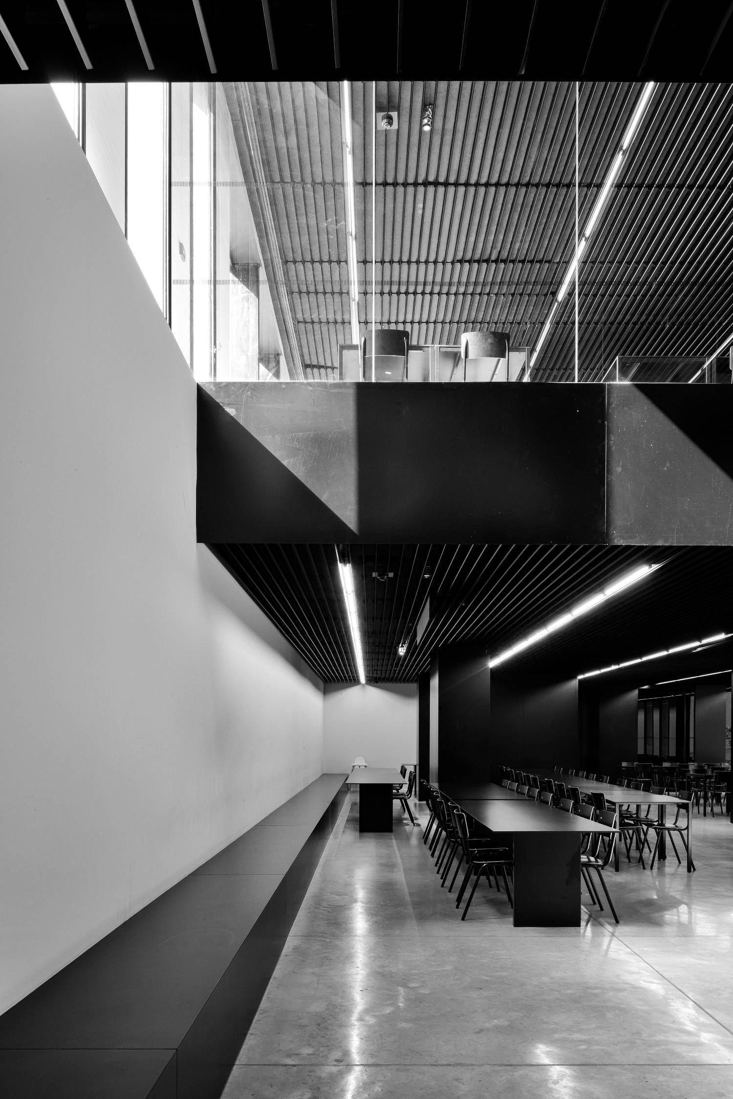
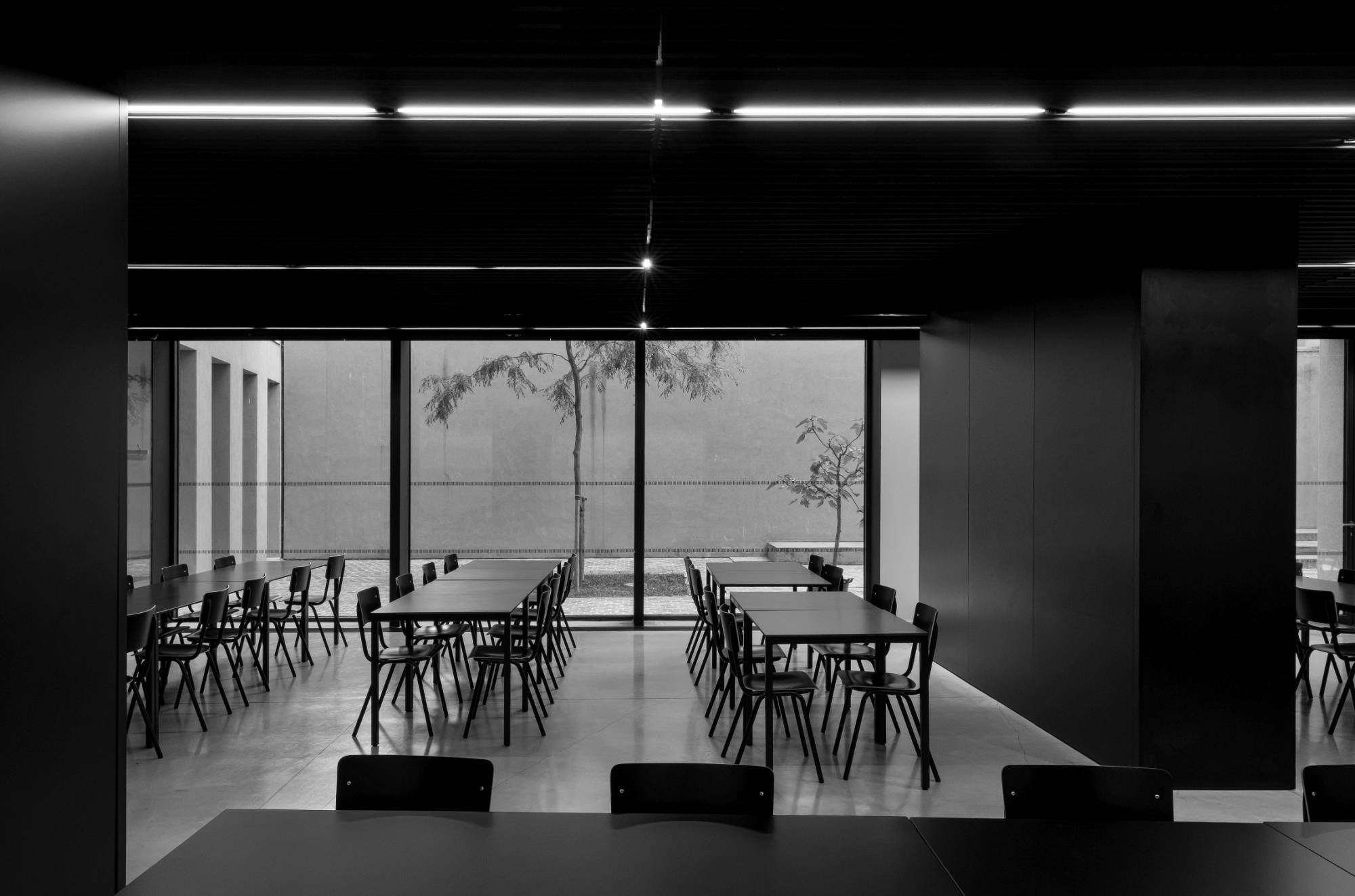
The programmatic organization of the building is clear and logical. A central entrance gives way to the public spaces on the ground floor and in the basement, as well as offering direct access to the bedrooms on the upper floors. The separation between public and private is further expressed through a consistent use of colour and materiality. The public functions are dressed in black, and colour is added by the guests and the surrounding environment. The bedrooms on the upper floors have a very sedate grey and white palette with accessories and hardware in black.
Through the use of large voids and a courtyard garden the basement does not give the experience of a subterranean space. The courtyard is bathed in sunlight in the morning, and the voids receive sunlight in the afternoon.
—
In collaboration with:
Publications:
DS Magazine, De Standaard, October 2014
Belgium New Architecture n°5, November 2011
de Architect, July/ August 2011
Photography:
